 In B2B digital marketing, we find ourselves constantly analyzing websites. We believe that websites are the foundation of digital marketing programs and, therefore, are constantly taking notice of how websites look and perform. When it comes time to talk to our clients about their websites and begin redesign projects, it’s crucial to understand precisely what it is that we’re working to improve.
Before thinking about how to change the site visually, it’s important to take a data-driven approach to analyzing the site’s inner layers: the function, structure, and voice. You can use this framework to analyze the site as a whole, the individual pages, and the separate sections that make up a page. When you connect design improvements back to these factors, your decisions are meaningful and easy to communicate.
Starting with data first also allows you to prioritize high-value changes over low-value changes. Perhaps most of your site traffic is to four of sixty total pages. Those four pages are more valuable and should be prioritized for a refresh, especially if they are high traffic pages with poor performance in bounce rate or time on page. Using a tool like Google Analytics helps gather the data you need to discover where and how users spend time on your website.
Now, let's walk through four factors to consider in your next redesign project.
1. Function
A website’s function is what it does. In the digital marketing world, that amounts to getting the audience to perform a specific action like buying a product or filling out a contact form. Individual pages and sections also have functions. Always keep these functions in mind when analyzing the site’s design. If the design isn’t helping the website do its job, it’s time to refresh.
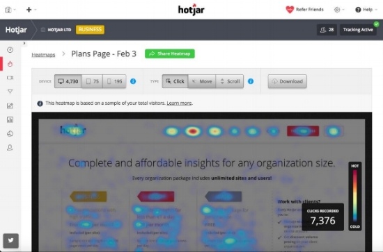
When analyzing function, note if the site is not currently doing its job, or if you should add or change functionality. An important key is understanding who uses your site and what they use it for. Heat mapping tools, like HotJar, can provide data on how users interact with pages and what kinds of elements they are most responsive to.
Hot Jar's heat maps show where users click and mouse-over on pages
2. Structure
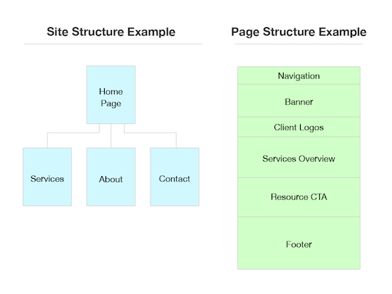
In this context, a site’s structure is the different pages and how they are linked together. The main navigation of a website often defines the primary site structure, and navigation can be organized around products, services, industries, or buyer personas. For an individual page, the structure is the different sections—usually horizontally divided—and how they are ordered in sequence. Ideally, the structure is made of everything that’s needed for the site to fulfill its functions, and it’s organized into pathways that lead the audience from "square one" to an end goal.

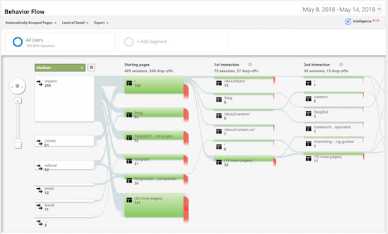
When analyzing a website’s structure, note if there are pages and sections that can be added or subtracted to better support the function, or if they can be arranged to better lead the audience. Google Analytics has a great use here, with the Behavior Flow data. This report shows how users move throughout your site. Making it easier for users to find their end location could result in lower drop-offs and higher engagement.
 Google Analytic's Behavior Flow report can show common user journeys through your website.
3. Voice
The voice is the collection of ideas that the site is communicating verbally and nonverbally. The voice resonates from the brand and resonates with an audience. It may involve ideas like “professional” and “intelligent” or “vibrant” and “caring” depending on the situation. Like functions, refer back to voice when deciding exactly why and how a site’s design needs updating.
When analyzing voice, ask yourself if the voice assists the function of the site and if it could be more effective at reaching the target audience. You may have multiple kinds of users with different preferences, which could influence the voice you use on pages targeted to each.
4. Visuals
Now that we understand the site’s function, we can determine if our visuals fit and how to make new ones. I divided visuals into a few basic categories: Colors, Imagery/Graphics, Layouts, and Typography.
When analyzing visuals, ask these questions:
- Colors: Does the palette work? Is it harmonious? Is it a good fit for the voice?
- Imagery/Graphics: Are they pleasing? Do they fit the voice? Do they help the audience and support the content?
- Layouts: Are elements organized into a hierarchy? Are important elements easily accessible? For sections of a page, can you add interest and variability to the layouts? Is there breathing room between elements?
- Typography: Is the text legible? Is there a clear hierarchy? Are the important points communicated quickly? Are there large blocks of text that can be broken up?
A good B2B website design analysis and redesign take all of these factors into account. With this framework, dissecting a website’s visual experience is simple and effective.


